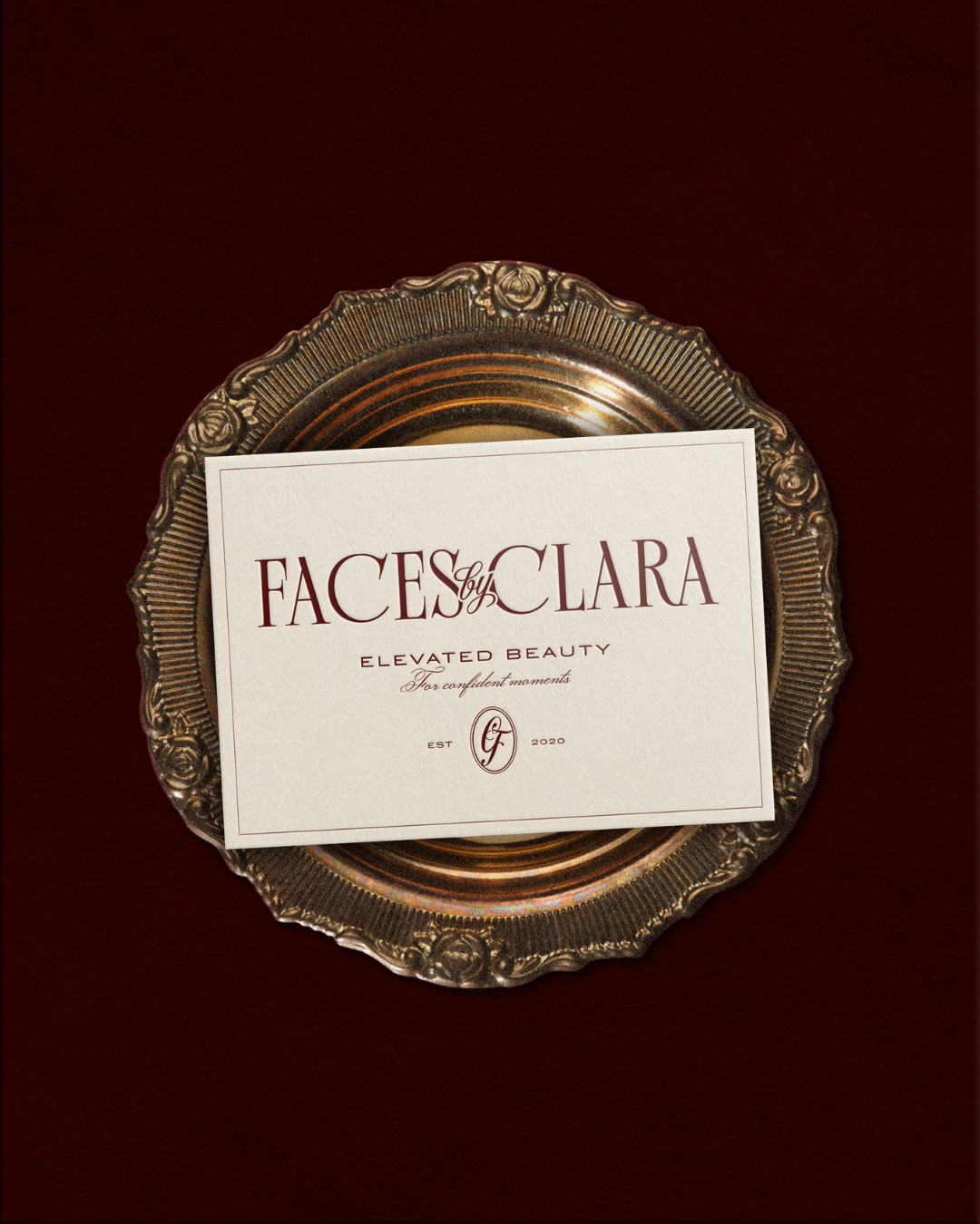
Some brands start out functional. They do the job, they look clean, they check the boxes. But they don’t quite feel like the person behind them yet. That’s exactly where Clara was before we started working together on her makeup artist brand design.
Faces by Clara had been building her bridal and beauty business in Boston and New England long enough for Clara to really understand who she is as an artist and who she wants in her chair. Her work is editorial and polished, but never cold. Glamorous, but the kind of glam that feels like you, just elevated. She knows her clients, she knows her style, and she needed a brand and website design that finally matched both.
So we built one that did.
Meeting Clara in Her Element
One of my favorite parts of working with clients is getting to meet them in person, and with Clara I actually got to see her in her element. We got to meet at an event in RI! While we were chatting with a few other girls, Clara just casually turned and asked one, “What’s your lip combo?” It was such a natural, genuine moment, and it told me everything.
She’s not performing expertise, she just lives and breathes it. She’s warm and fun and completely in her world. That kind of thing is hard to capture in a questionnaire, and it’s exactly why I think meeting clients in person (when we can) makes such a difference in the final brand. I knew exactly what this rebrand needed to feel like.
The Strategy Behind the Brand
The core of this makeup artist brand design was understanding that Clara isn’t just a service. She’s an experience. Her clients are brides, professionals, and content creators, women stepping into a moment that matters to them, and they’re choosing her because they want to feel like the best version of themselves, not a different version. That distinction shaped every decision we made, from the color palette to the typography to the way the website moves.

Color, Type, and the Details That Matter
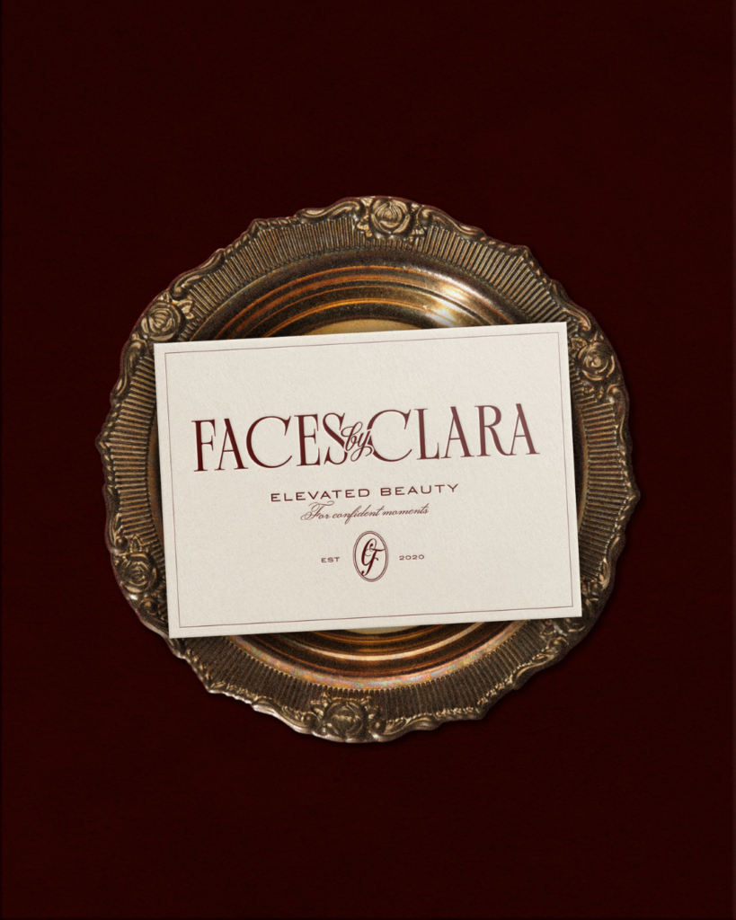
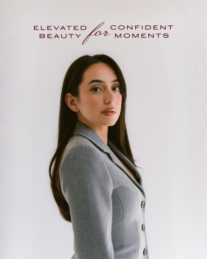
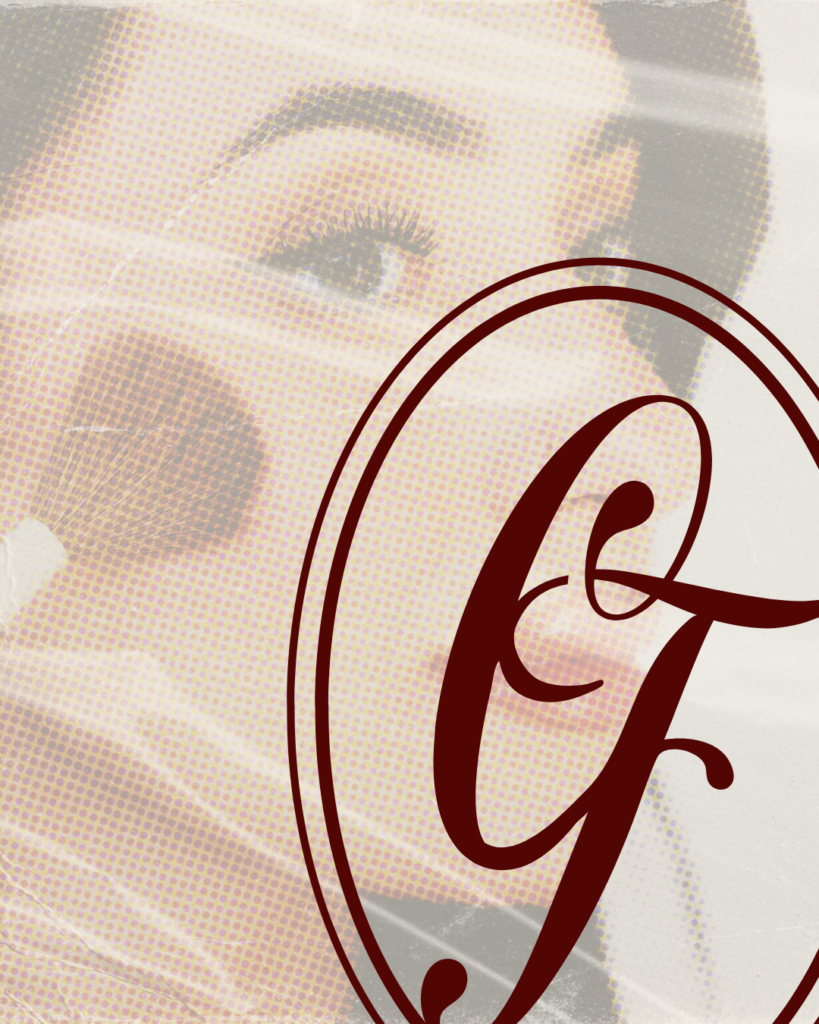
The colors are deep and rich: a dark cabernet, soft pinks, warm mauves. They feel expensive without feeling cold. The logo mixes a bold editorial serif with a handwritten script for the “by,” which creates that same tension Clara’s brand lives in: high-fashion and personal all at once. It’s the kind of beauty brand design that turns heads without trying too hard.
A Website With Real Texture
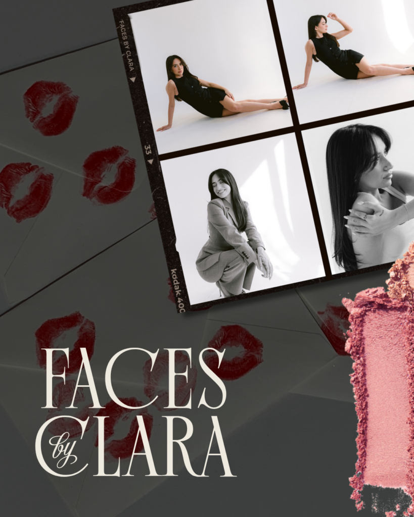
The website is where things got really fun. I wanted the site to have real texture and depth, not the flat, perfectly polished look that a lot of beauty businesses default to. So I actually smeared lipstick across a scanner to capture the real, layered texture of it and used that throughout the design. It sounds a little chaotic, but the result is exactly what we were going for: something that feels alive, tactile, and genuinely connected to what Clara does. We also pulled in film frames as a design element, nodding to the high-fashion editorial world her work belongs in. Those two things together gave the makeup artist website design a dimension you don’t usually see in the beauty space.
The Result
The result is a brand that feels like walking into Clara’s world before you even book with her. Glam, warm, a little editorial, and completely her. Whether she’s working a Newport wedding or a Boston editorial shoot, the brand holds up and turns heads.
This is the kind of project I love most: working with makeup artists, beauty professionals, and service-based small businesses where the strategy and the artistry get to work together. When the person behind the brand finally sees themselves reflected back in it, that’s when you know the makeup artist brand design is right.