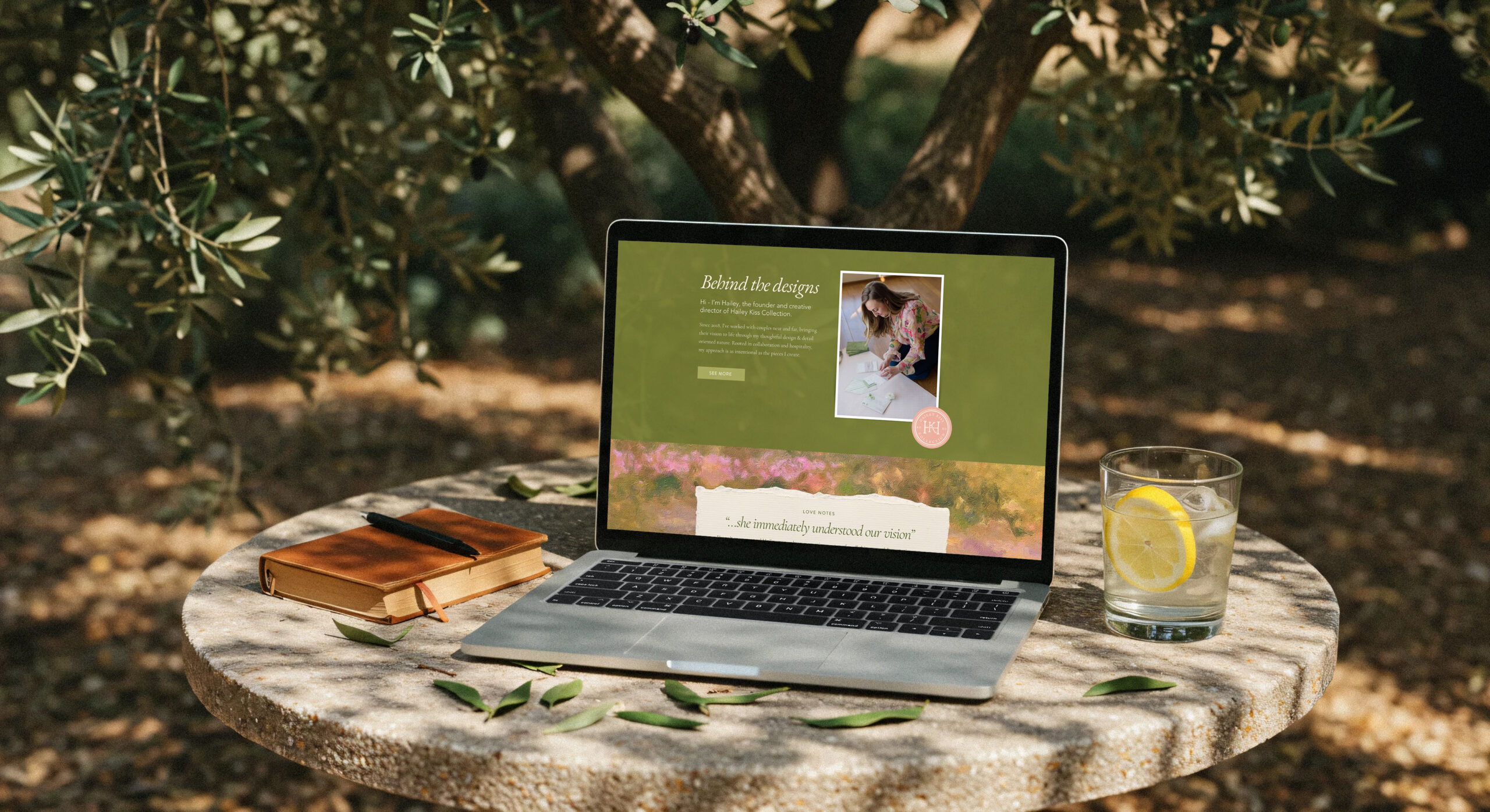
When Hailey first reached out, the plan was pretty simple: refresh her existing branding and give her website a facelift.
As we started talking, though, it became clear that there was a much bigger story to tell.
Hailey creates custom and semi-custom wedding stationery, but what really stood out to me was how she talked about the experience. She wasn’t focused on creating “pretty invitations.” She talked about paper weight, printing techniques, texture, postage, and all of the little details that most people don’t think about until they’re planning a wedding.
One thing she wrote in her brand questionnaire stuck with me:
“I want every completed invitation suite to bring tears to their eyes.”
That became the foundation for the project.
The goal wasn’t to redesign her business from the ground up. It was to create a brand that felt like the same experience her clients receive when they open one of her invitation suites—thoughtful, personal, beautifully crafted, and something worth holding onto.
The Goal
Hailey is a multi-year Best of Rhode Island wedding stationery designer, but her visual identity hadn’t grown alongside her business.
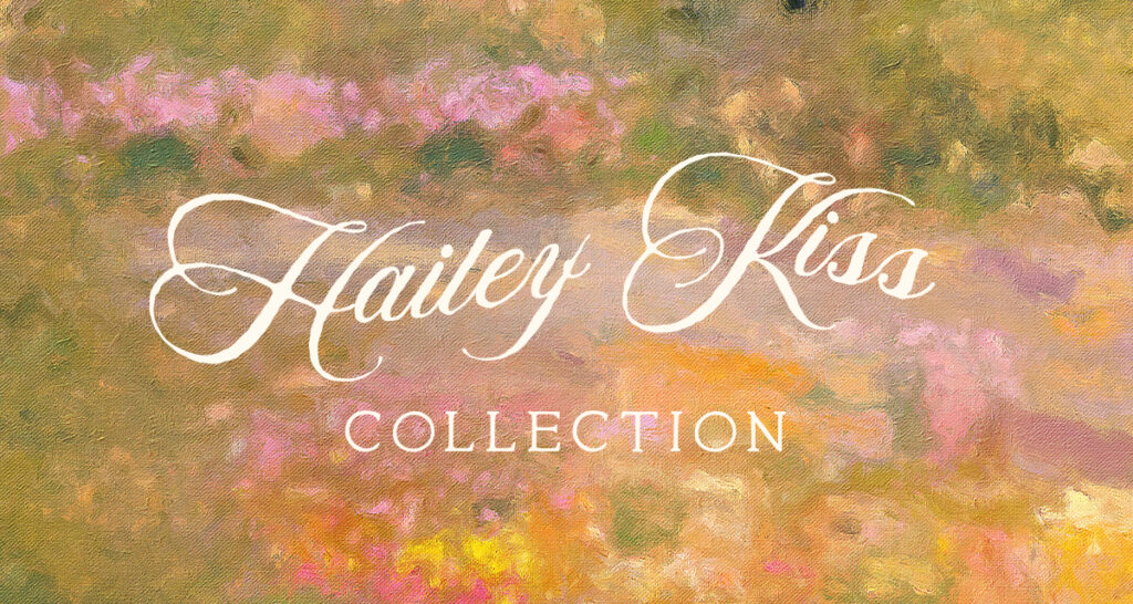
Her logo was simply her handwriting, and while it felt personal, it wasn’t telling the full story. There was an opportunity to build a more complete brand system—one that reflected the level of craftsmanship behind her work and made room for both her custom designs and growing Semi-Custom Collections.
At the same time, we redesigned her Wix website to better organize her services, showcase her portfolio, and create a much smoother inquiry experience through HoneyBook.
The Brand Direction
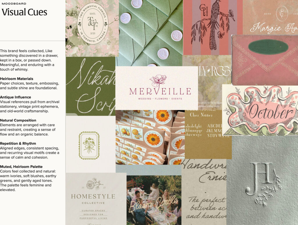
Every branding project starts with a few words that act as a filter for every design decision.
For Hailey, we kept coming back to these:
- Handcrafted
- Heirloom
- Personal
- Tactile
- Elevated
As we built the brand, I kept thinking about the feeling of opening an envelope you’ve been waiting for.
You notice the paper before you even read the invitation. The embossing catches the light. The envelope liner, the printing, the tiny illustrated detail in the corner—it all feels intentional.
That slower, more thoughtful experience became the direction for the entire project.
The Inspiration
One of my favorite ideas from this project came from the history of printmaking.
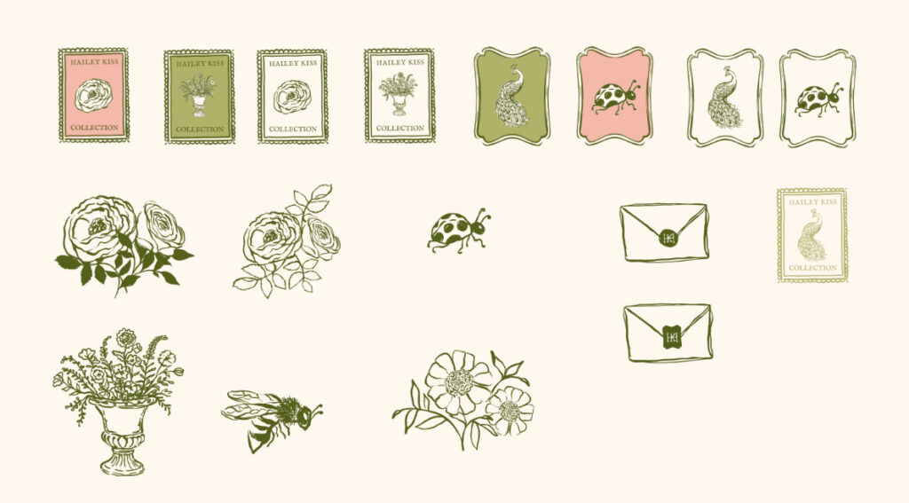
Early print shops often used a small printer’s mark—a symbol that quietly identified where the piece came from. It wasn’t meant to be the main attraction. It was simply the studio’s signature.
That felt like a natural fit for Hailey.
Instead of inventing a new icon just because every brand “needs one,” we looked at her own wedding invitations. She had a small peacock illustration that already carried personal meaning, so we reworked that into a modern studio mark for her brand.
Now it can appear throughout her website, printed pieces, and packaging as a subtle thread that ties everything together.
We used a lot of Hailey’s own work in her moodboard as well – pulling from the pieces that already make her brand and business unique.
The Website
The brand didn’t stop with the logo.
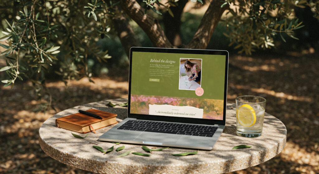
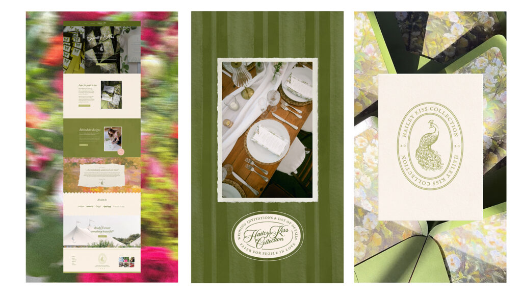
We paired the refreshed identity with a custom Wix website that better reflects the experience of working with Hailey.
The site now guides couples through her services more intentionally, highlights both custom and semi-custom collections, showcases a growing portfolio of real weddings, and makes it incredibly easy to inquire with an embedded HoneyBook form.
Instead of information living in five different places, everything now works together to tell one cohesive story.
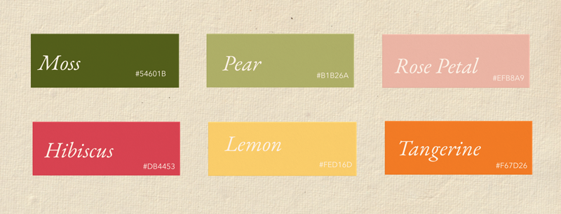
The Color Palette
Color became another way to communicate emotion.
Instead of leaning into traditional wedding neutrals, we built a palette inspired by a blooming garden—lush greens, soft peony pinks, warm creams, and rich floral tones.
The result feels joyful, artistic, and welcoming. Proof that elegant doesn’t have to mean beige.
The best part of any branding project is watching all of the pieces come together.
My Favorite Detail – The Texture
One of my secret weapons when I’m building a brand is Photoshop Actions. I use them to manipulate photography and imagery into watercolor, oil paint, and other textural styles – and it’s one of my favorite ways to create something you’re not going to find in a stock image library. ( You can find these actions on Creative Market or Envato Elements!)
For Hailey, this gave us another way to bring that tactile, handcrafted feeling into the brand. I could take imagery, manipulate it, pull in her actual brand colors, and turn it into custom backgrounds and textures that feel like they belong specifically in her world.
It’s a small behind-the-scenes part of my process, but honestly, it’s one of the things that makes a brand feel really custom.
Final Thoughts
I think my favorite takeaway from this project is how much personality can live inside something that still feels elegant and timeless.
For Hailey, that meant color, painterly textures, little illustrations, a peacock pulled from her own wedding stationery, and details that feel almost collected over time. Everything has a little bit of character, while still feeling polished and intentional.
The finished brand feels like the experience Hailey creates for her clients: personal, thoughtful, tactile, and really special to receive.
Ready for your own brand refresh?
Sometimes you don’t need to start over. You need to figure out what’s already working, what feels most you, and build a stronger brand around it.
If your business has grown but your branding hasn’t quite caught up, I’d love to hear what you’re working on.