Designing a brand inspired by the making process itself

Every little detail deserved to have a story.
As we started talking about Corkie’s business, one thing kept coming up.
She never described her jewelry as products.
She called them treasures.
Pieces people save for birthdays, anniversaries, new chapters, or simply because they wanted something that felt like them. Some are custom heirlooms. Others are made from colorful gemstones or overlooked diamonds that get a second life. Every piece begins with a conversation and ends with something that becomes part of someone’s story.
That idea became the foundation for the entire brand.
If every piece is thoughtfully made, the branding should feel thoughtfully made too.
Not polished to perfection. Collected. Personal. Full of tiny moments waiting to be discovered.
Meet Corkie Bolton Jewelry
Based in Rhode Island, Corkie Bolton is a jewelry artist creating colorful custom jewelry inspired by storytelling, craftsmanship, and individuality.
Her work blends traditional metalsmithing with engraving, colorful gemstones, and one-of-a-kind details to create jewelry that feels collected over time instead of mass produced. She intentionally chooses quality materials, including recycled precious metals and ethically sourced stones whenever possible, and describes many of her pieces as “future heirlooms” built to last for generations.

The Goal
The project wasn’t about creating another luxury jewelry logo.
It was about creating a brand that felt as handmade as the jewelry itself.
We wanted people to immediately understand that these weren’t pieces coming off an assembly line. They’re designed by one artist, made with intention, and often become keepsakes tied to someone’s memories.
There was another balance we wanted to strike, too.
Jewelry naturally carries a sense of luxury, but Corkie’s personality is playful, welcoming, and full of color. The brand needed room for both.
Brand Direction
Some of the words we kept coming back to were:
- Handcrafted
- Heirloom-inspired
- Joyful
- Storytelling
- Collected
- Playful luxury
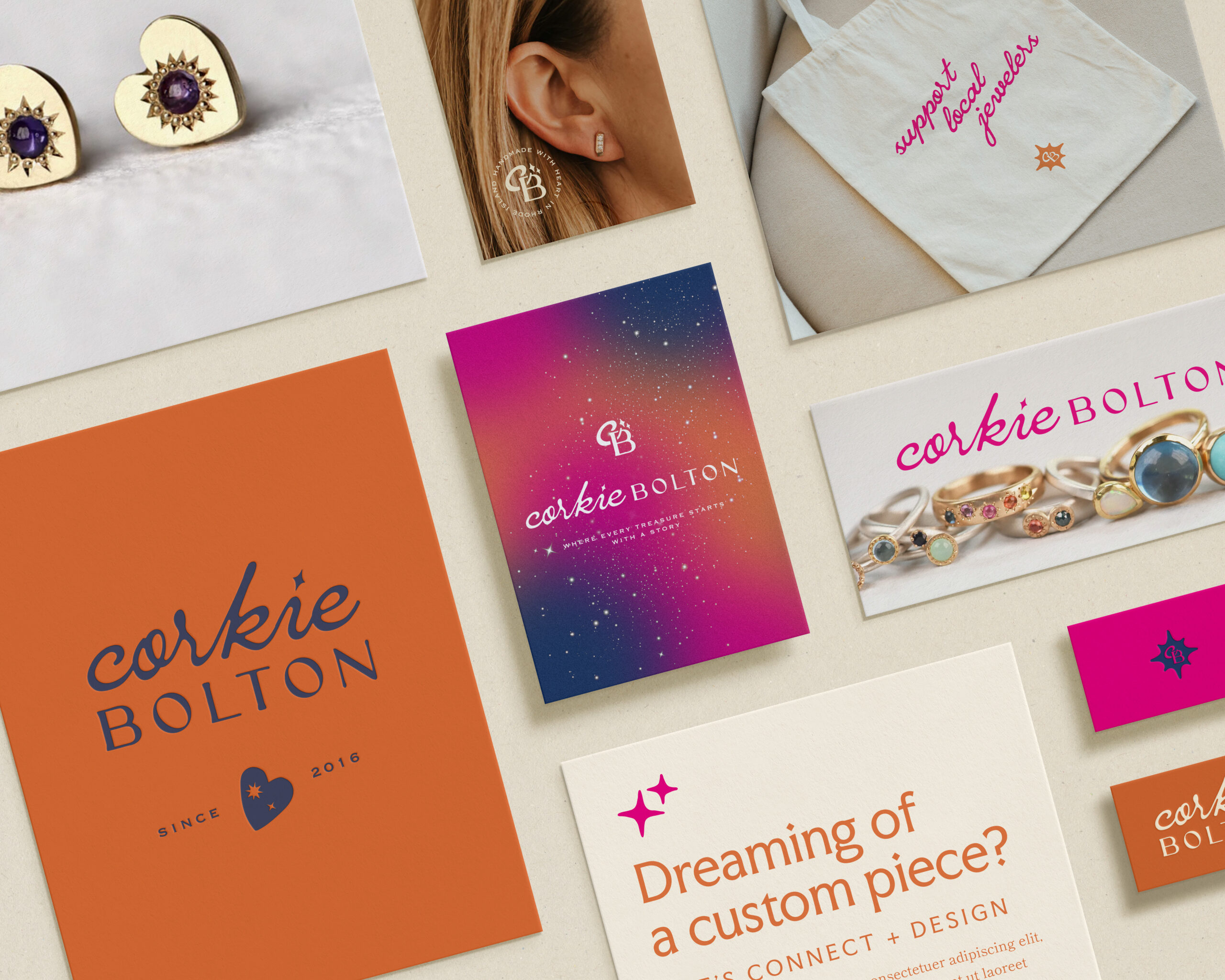
Instead of feeling overly polished or traditional, we wanted the brand to feel like opening a jewelry box that’s been growing for years.
Every piece inside has its own story.
Nothing matches perfectly.
Somehow it all belongs together.
That became our design philosophy throughout the project.

Pulling Inspiration from the Jewelry Itself
One of my favorite parts of branding is finding inspiration where people wouldn’t expect it.
For Corkie, we didn’t need to look very far. The jewelry became the inspiration.
One of the biggest design decisions was pairing two completely different type styles together.
A handwritten script brings warmth and personality. It feels like signing a note, sketching an idea, or leaving a maker’s mark on the back of a piece.
Alongside it, we introduced an engraved-inspired typeface that nods to traditional jewelry making. The letterforms have a carved quality that reminds me of vintage signet rings, hand engraving, and the craftsmanship behind every piece.
Separately, they’re very different. Together, they tell the same story Corkie tells through her work: bringing unexpected elements together to create something beautiful.
That idea carried through everything else.
- The grainy gradients mimic the colorful glow of gemstones.
- The sparkles reference engraved starbursts and the way stones catch light.
- Layered typography creates the feeling of a collection that has grown over time instead of being perfectly curated.
- Even the layouts intentionally feel a little collected- like discovering treasures along the way rather than placing everything into neat little rows.

Color Palette
The colors were never meant to compete with the jewelry.
They create the feeling surrounding it.
Rich jewel tones bring energy and personality while softer neutrals give the gemstones room to shine. Bright pops of color reference sapphires, opals, and the unexpected combinations that show up throughout Corkie’s work.
The overall palette feels creative, optimistic, and a little nostalgic.
Just enough color to make you smile without distracting from what matters most.
My Favorite Detail
The smallest details are usually my favorite.
For this project, it’s the little heart. At first glance it looks like a simple brand mark.
It’s actually inspired by one of Corkie’s own jewelry designs.
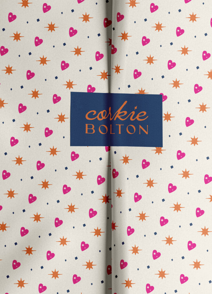
That same heart connects back to one of the brand phrases, “Handmade with Heart,” turning a piece of jewelry into something that appears throughout the entire identity—from stamps and packaging to social graphics.

The Final Brand
One of the things I love most about this project is that it doesn’t rely on one logo to do all the work.
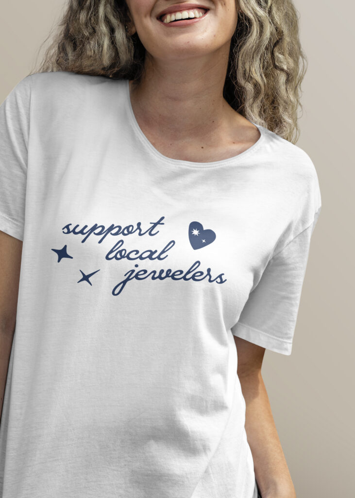
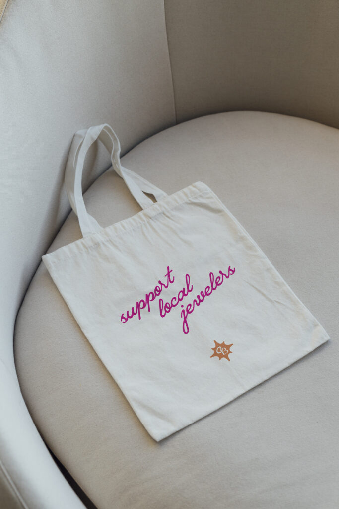
Instead, it became a complete visual system.
Different logo variations.
Custom illustrations.
Meaningful icons.
Typography that reflects the making process.
Color inspired by gemstones.
Packaging that feels exciting to open.
Every piece works together the same way a jewelry collection does—each one slightly different, but unmistakably part of the same story.
Final Thoughts
Projects like this are my favorite because the inspiration was already there.
It lived inside Corkie’s process, her craftsmanship, and the stories behind the jewelry she creates.
The branding simply gave those ideas a visual language.
When every detail has a reason for existing, the final brand feels cohesive without trying too hard. It feels personal because it actually is.
If you’re looking for a brand identity that starts with strategy instead of trends, I’d love to hear your story.
Find more of corkie’s work here!