
Some brands start with a logo. Sereine started with a feeling.
When Taylor and Greta came to me, Sereine was still mostly an idea- a luxury hair salon they had dreamed about opening together after working side by side in Providence for more than a decade. They already knew what they wanted the space to feel like: calm, beautiful, welcoming, high-end without feeling stuffy, and somewhere getting your hair done could feel a little bit like an escape.
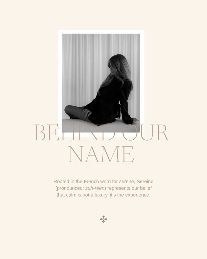
The name itself gave us a pretty good place to start. Sereine is French for serene, and that feeling of calm ended up influencing nearly every decision we made.
The interesting part was figuring out how to communicate it without making the branding feel like a spa or relying on obvious beauty-industry imagery.
The Goal: A Luxury Salon Brand That Feels Calm
Taylor and Greta had worked together for years before deciding to open Sereine, so this was very much a labor of love between two friends who already knew how they wanted to work and what they wanted their salon experience to be.
They specialize in custom color, lived-in blonding, extensions and precision cutting, but their vision for Sereine went beyond the services themselves. They wanted the experience to feel personal, unrushed and considered.
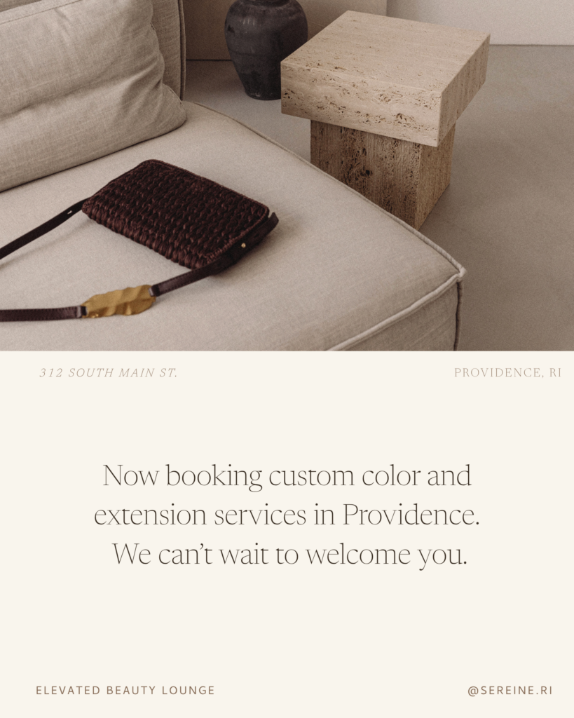
At the same time, they were designing the physical salon on South Main Street in Providence. That gave us a really nice visual starting point because the interiors and branding could influence one another instead of feeling like two completely separate projects.
The salon was taking shape with warm neutrals, organic materials, clean lines and a sense of softness, so I wanted the brand to feel at home there from day one.
The Brand Direction
We kept coming back to five words:
Sophisticated · Luxe · Effortless · Welcoming · Organic
The overall idea was a brand that felt like an escape.
I wanted there to be plenty of breathing room. Soft light. Warmth. Subtle texture. Nothing overly trendy or visually loud. The luxury here needed to feel quiet and comfortable rather than precious.
That became an important filter throughout the process. Every design decision had to feel like it could exist naturally inside the salon.
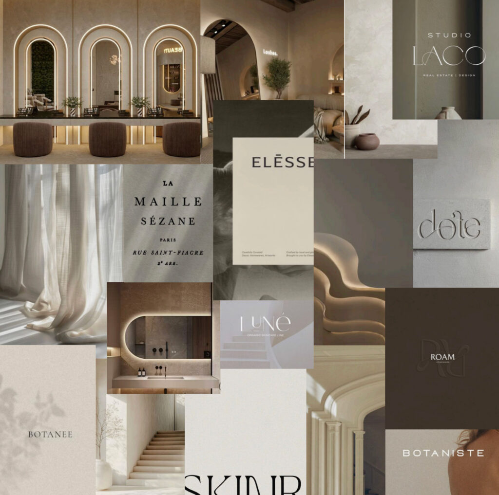
The Inspiration: Creating a Feeling Without Being Too Literal
One of my favorite things about this brand is how many of the references are there without immediately announcing themselves.
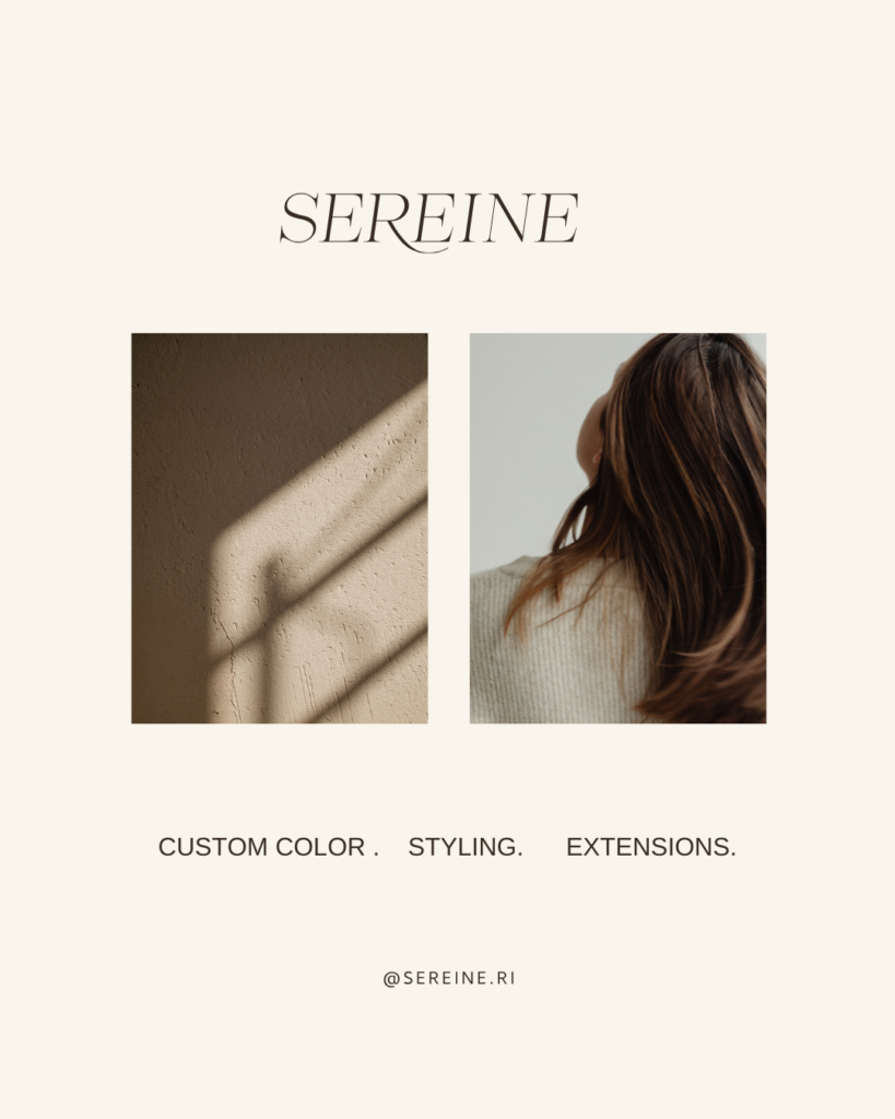
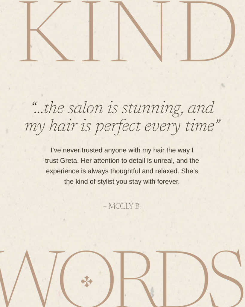
The primary logo is thin and slightly italic, which gives it a subtle sense of movement. There’s something almost breeze-like about it, which felt right for a brand centered around ease and calm.
Then there’s the R. The little sweep coming off the letter has this wispy quality that reminds me ever so slightly of a strand of hair. I didn’t want a logo with scissors, a woman’s profile, or anything that immediately said HAIR SALON. This gives us that connection in a much quieter way.
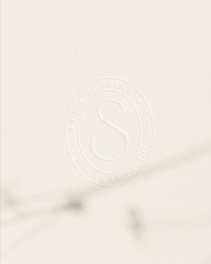
We also incorporated small French-inspired details throughout the brand, including a fleur-de-lis-style brand mark. Since the name itself comes from the French word for serene, it gave us another layer to play with without turning the entire identity into a Paris theme.
Those tiny references are probably my favorite kind of branding detail. You don’t necessarily need to consciously notice every single one for them to contribute to how the brand feels.
The Color Palette
The palette came pretty naturally from the salon itself.
Rather than introducing a bunch of new colors, I pulled from the warm, earthy feeling Taylor and Greta were already creating in the interiors: chestnut brown, clay, oat, honey and a warm ivory.
It gives us enough contrast to keep the brand interesting while still feeling really soft as a whole.
The warmer browns also keep the neutral palette from feeling stark or clinical. Sereine is minimal and clean, but it still needed warmth. This is a salon where you’re supposed to settle in and stay awhile.
Taking Sereine Online with a Showit Website in a Day
Once the branding was complete, we carried the same visual direction into Sereine’s Showit website through my Website in a Day service.
Because Sereine was a new business, they didn’t need an enormous website with complicated functionality. They needed a polished home base where someone could understand the salon, meet the stylists, explore the services and know exactly how to get in touch or request an appointment.
We kept the website clean and relatively minimal, with lots of negative space, soft imagery and typography that echoed the branding. The goal was for someone to move from their Instagram to the website to the actual salon without feeling like they’d entered three completely different worlds.
It also gives Sereine somewhere to grow. The site can evolve alongside the salon as their team, services and business continue to expand.
LEARN ABOUT WEBSITE IN A DAY →
The Final Brand
This is one of those projects where I really love seeing everything together. The typography is delicate. The palette is quiet. The photography uses shadows and negative space. The little French references show up here and there. Together, it creates the calm we were trying to communicate from the beginning.
And once Taylor and Greta had their brand shoot, we got to see that visual world become very real. Photos by the talented Megan Therese Photography
Behind the Design: Sereine’s “Debut Issue”
Okay, this is one of those tiny branding details that could very easily get missed in the finished photos, but I loved making it.
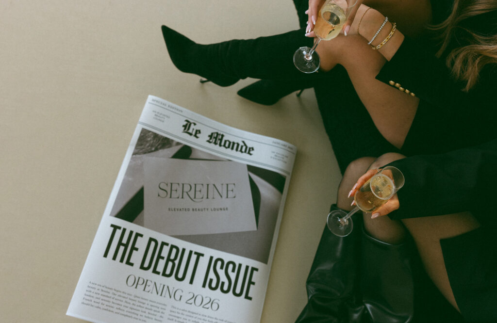
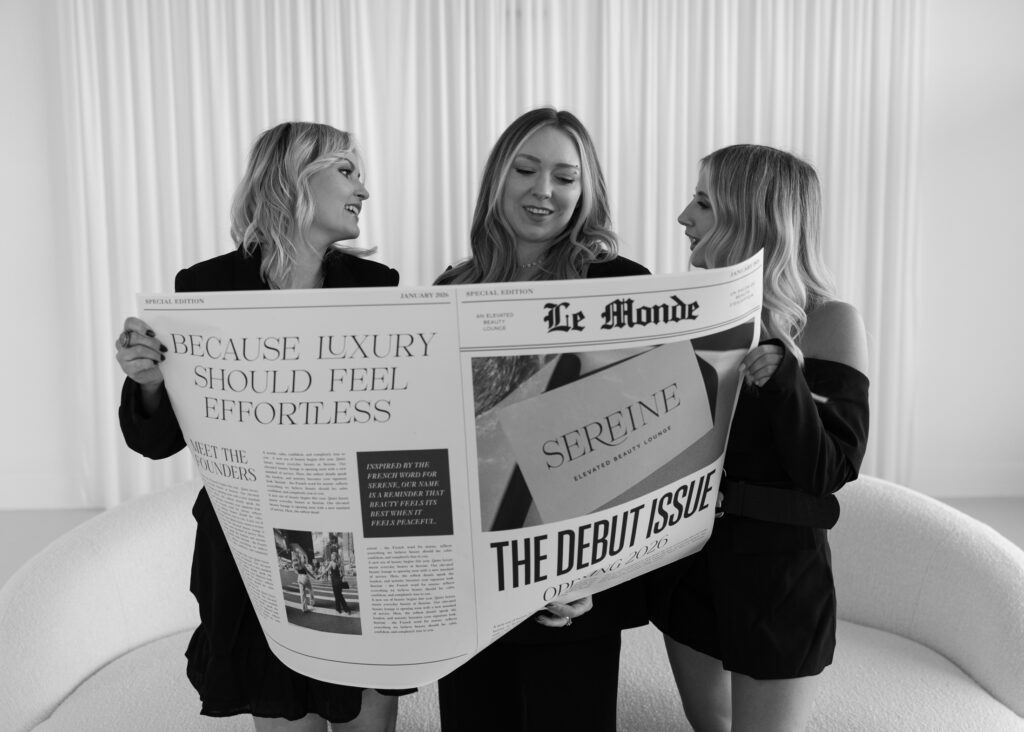
For Sereine’s launch shoot, we created a custom newspaper inspired by Le Monde. Since we already had this subtle French thread running through the identity, I wanted to find a way to carry it into the shoot without making it feel costume-y or overly themed.
We treated it as Sereine’s debut issue, because they were quite literally debuting the salon.
It became this oversized editorial prop they could actually hold and interact with during the shoot, complete with Sereine branding and launch details. They also had their logo printed on director’s chairs, which gave the shoot this slightly glamorous, editorial feeling that worked so well with the rest of the brand.
I love details like these because this is where having a full visual identity becomes really fun. Once you have the foundation, the logo doesn’t have to do all the work. You can start asking, Okay, where else can this idea go?
A newspaper. A director’s chair. Signage. A website. Social content. Tiny details someone may only notice on a second look.
Those pieces start creating the larger world around the business.
Photos by the talented Megan Therese Photography
Final Thoughts
I think Sereine is such a good example of why I like starting with how a business should feel, especially when I’m branding a physical space.
“Calm” could have gone in a million different directions. For Sereine, it became the movement of an italic letterform, the curve of an R, warm neutrals, soft shadows, negative space, organic texture and a website that gives everything enough room to breathe.
None of those decisions are particularly loud. They don’t need to be.
And now the branding feels like it belongs inside the space Taylor and Greta spent years dreaming about creating together—which is probably my favorite part.
Looking for Branding or a Showit Website of Your Own?
If you’re opening a new business, refreshing one you’ve outgrown, or have the vision in your head but aren’t quite sure how to turn it into an actual brand, I’d love to help.
I offer custom branding and Showit website design for small businesses in Rhode Island, New England and beyond. And if you already have your branding and need a beautiful, strategic website without a months-long process, you can also check out my Website in a Day service.